
Ruff Haus Pets Website Redesign

PROJECT OVERVIEW
Ruff Haus is a local pet store in Chicago, IL. They have been around since 2000 taking pride in being at the forefront of pet nutrition with a dedication to quality and a rigorous vetting process for the foods they carry. Their sales do great in store but they noticed a high bounce rate by users trying to shop online. They wanted to redesign their website to improve the user experience and increase sales online.
Through extensive research and iterations, I want to come up with a seamless solution. This conceptual project was created as part of a UX/UI Design Bootcamp at General Assembly.
My Goal: Conduct competitive and comparative analysis to help understand what our competitors are currently doing well and help determine what features Ruff Haus could benefit from in a redesign.
Tools
Figma
Jotform
Zoom
Optimal Workshop
Roles
UX/UI Designer
UX Research
Time Span
2 week sprint
DESIGN PROCESS
I decided to use the Double Diamond design process to help us understand and communicate this redesign, knowing that its going to be iterative at all phases. The 4 phases are Discover, Define, Develop and Deliver.

Discover
WHAT ARE OUR COMPETITORS DOING WELL THAT WE CAN BENEFIT FROM?
To get started, I wanted to research some of Ruff Haus’ competitors, comparing features for both my direct and indirect competitors. Seeing what we have and if anyone is doing it better. My 5 direct competitors I looked at were Kriser’s, Petco, Bentley’s Pet Stuff, Pet Supplies Plus and Petsmart.

The 4 indirect competitors sites I looked at were Amazon, Walgreens, Nordstrom and Kroger.
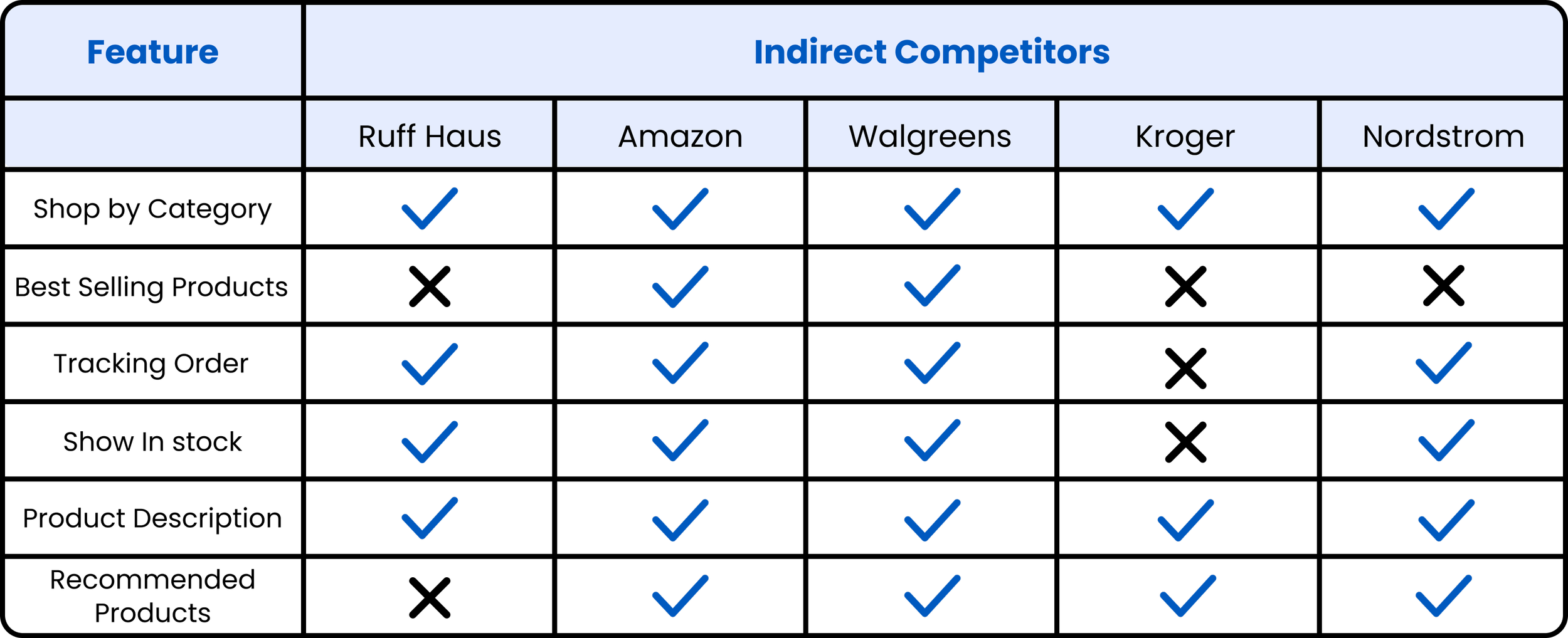
Although Ruff Haus does have a lot of the same features, I noticed a handful of things that competitors did better that Ruff Haus could benefit from. Below are a few things i noted:
Petsmart has an added to cart tab that pops out when something gets put in their cart which I like because they can either decide to go right to their cart or continue shopping without getting redirected.
Kriser’s does a really good job showing additional products that users might not have been thinking about in their initial search which can lead to adding more things to their cart.
Nordstrom checkout process is super easy, since everything is all on one page instead of having shipping, contact and payment all separate (this leads to less clicks and faster checkout).
All of these competitors have white backgrounds, super visible text, clean global navigations and stronger CTA buttons.

RUFF HAUS NAVIGATION AND VISIBILITY NEED SOME LOVE
From a first glance at Ruff Haus site, a few things I noticed were that the global navigation is overwhelming, it's very dark all throughout the site with little to no contrast and it's really hard to read the text due to the different font choices.

Define
STEPPING INTO THE SHOES OF KATHERINE ROSE
It was important for me to bring one of my users to life and to remember who I am designing for, so I created Katherine Rose as my user persona. This helped me understand what the current problem with Ruff Haus site is.

SO, WHAT’S THE PROBLEM?
Once I figured out Katherines needs and pain points, I was then able to transition into defining the problem her and other users were facing.
Katherine needs better product descriptions and suggestions so she can feel confident in the dog food she is ordering for Chip.
HOW MIGHT WE SOLVE FOR THIS?
This is where I had to start brainstorming. So I turned my problem statement into a few How Might We Statements.
Some of the initial questions to help me explore potential solutions are:
How might we elaborate on product descriptions and showcase suggestions for Katherine so she can confidently order the perfect food for Chip?
How might we rework site navigation and suggest products for Katherine so she can find quality dog food at ease?
How might we elaborate on product descriptions and increase the amount of reviews left on products so Katherine can confidently make a purchase?
How might we showcase our products so Katherine can search and find new dog food at ease?
I ended up using the top 2 questions the most to help me throughout the whole process.
MVP REVEAL
Looking at my insights from the discover and define phase, I am able to confirm that my minimum viable product will be a pet store website redesign. Below are some of the must-have features I think it will be important to include:

Develop
KATHERINE’S FLOW THROUGH THE SITE
I wanted to create 2 task flows for how users like Katherine might navigate through the site. The first task is to find a “suggested for you” product after searching for the honest kitchen dog food.
User goal: For the user to find suggested or recommended items based on their initial search.

The 2nd task is to add Acana wholesome grains free run poultry dog food to your cart and go through checkout process
User goal: For the user to have an easy and recognizable checkout process.

SUCCESSFULLY GOING FROM 22 PRIMARY NAVIGATION OPTIONS DOWN TO 6
I needed to decide the organization, search and navigation systems that would help users like Katherine complete those 2 tasks, find what they need and understand what they've found. I conducted an open card sort with 15 users to discover how they interpret and categorize the products on Ruff Haus site. I gave all 15 users 52 product cards and asked if they could group them in ways that made sense to them and to give those groupings a category name. Based on this data, I was able to go from 22 primary navigation options down to 6.
The 6 categories I was able to make were dog supplies, cat supplies, pet food, pet health, grooming and training. From there I was able to decide the rest of the site structure.

LO-FIDELITY WIREFRAMES
Once I had some initial ideas down on paper, I was able to move over into figma to turn those sketches into something digital. This helped bring more sense and structure into the new design of the website and the features I wanted to implement.

LO-FIDELITY PROTOTYPE
Click here to see the first version of my prototype.
IMPORTANT FOR USERS TO TEST OUT THE USABILITY
I tested my prototype with 7 users to see if they could find a "suggested for you" item and complete the checkout process. I guided them through the prototype and asked them questions. The goal was for users to easily search for dog food, complete the checkout process in under 3 minutes, and make no more than 1 mistake.
QUANTITATIVE METRICS
I wanted to measured success rate, # of clicks, how long it took to complete all tasks, and total errors.

QUALITATIVE METRICS
I also wanted to measure by dialogue, their likes/dislikes and from a satisfaction survey.

Some additional feedback i got from the 7 who tested:
User 1 wanted to click on other things on the home page first before thinking about the search bar
Most users wanted to click on the left side categories to narrow search on product search page
User 4 liked that it had the cancel order option just in case she needed to change anything
Most users thought the process was easy and made sense to them
CHANGES TO MAKE THEIR EXPERIENCE EVEN BETTER
After Usability Testing, I improved user experience by implementing feedback. I enhanced the prototype to hi-fidelity and added a feature for users to narrow their search on the full product list page. I removed the search result and cart notification from the search bar, as they are not needed on the confirmation page. Additionally, I made minor adjustments such as standardizing button size and improving wording clarity.

DEFINING THE BRAND
Before creating the hi-fidelity prototype, I needed to determine the brand, the look and feel of this redesign to tie in the UI components.

HI-FIDELITY PROTOTYPE
Click here to see the second version of my prototype.

NEXT STEPS TO TAKE
To keep iterating on this site, here are some things i would love to do next:
Work on a full mobile prototype of the site
Create a new flow of being able to open up and leave reviews
Do another round of usability testing to validate new designs
A start to the look and feel of the mobile version so far:

WHAT I LEARNED
I learned how important clear typography and navigation can truly improve the users experience on a site. I also feel like I improved my skills on conducting competitive and comparative analysis. Seeing what your competitors are doing well can be a huge part in determining how you want to redesign, especially using components that users are already familiar with.